Redesigning Building Operations for Speed and Clarity
Creating a dashboard, alert system, and access tools that empower property staff to act fast and stay aligned
CLIENT
Level Home, Inc (now Ambient)
TIMELINE
July – September 2023
TEAM
Partnered with client-side product lead, engineers, and internal design team
Overview
After merging with Dwelo, Level launched Level M—a smart home platform for multi-family property operations. While the tech stack was robust, the staff-facing experience was fragmented. Core functionality was split across disconnected tools, creating friction in day-to-day workflows and increasing the risk of missed tasks and miscommunication.
Material+ (M+) was brought in to consolidate and elevate the experience. We weren’t just designing a dashboard—we were building clarity into complex systems. By unifying functionality into a single interface, we helped staff respond faster, reduce errors, and work with greater confidence and alignment.
My Role
I led the design of three core features within the Level M platform: the Home Screen dashboard, a new global navigation system, and the access permissions experience.
My focus was on translating operational complexity into calm, intuitive tools that aligned with how teams actually work. I proposed and developed features that went beyond the original scope—including a lightweight notification system and a simplified access logic model—grounded in real user needs.
I worked closely with Level’s Head of Product, internal designers, and engineering teams across six Agile sprints. While I contributed to the early structure of the Design Language System in a consultative role, my primary responsibility was driving product design across these high-impact areas, from discovery through delivery.

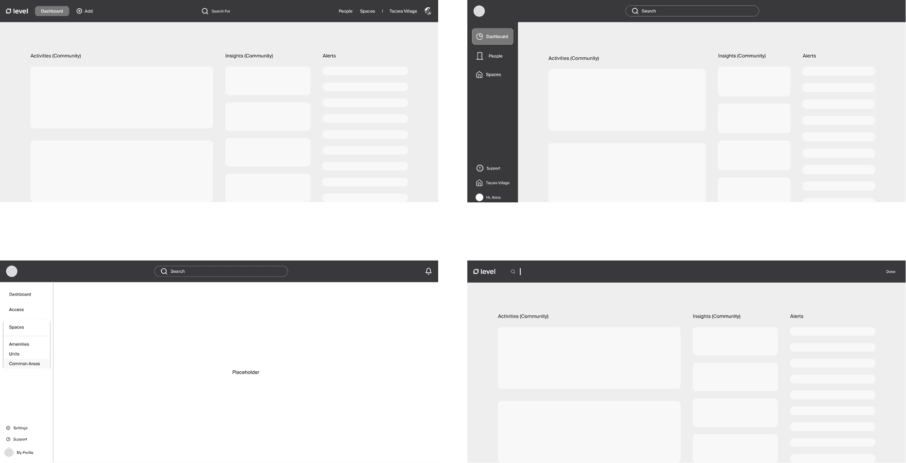
Home Screen Dashboard
A centralized view where staff can see real-time updates and building status at a glance

Access Permissions
A control panel for granting, adjusting, and revoking access to units, buildings, and shared areas

Global Navigation
A system-wide structure that enables staff to navigate tools and tasks, with search positioned as the primary entry point
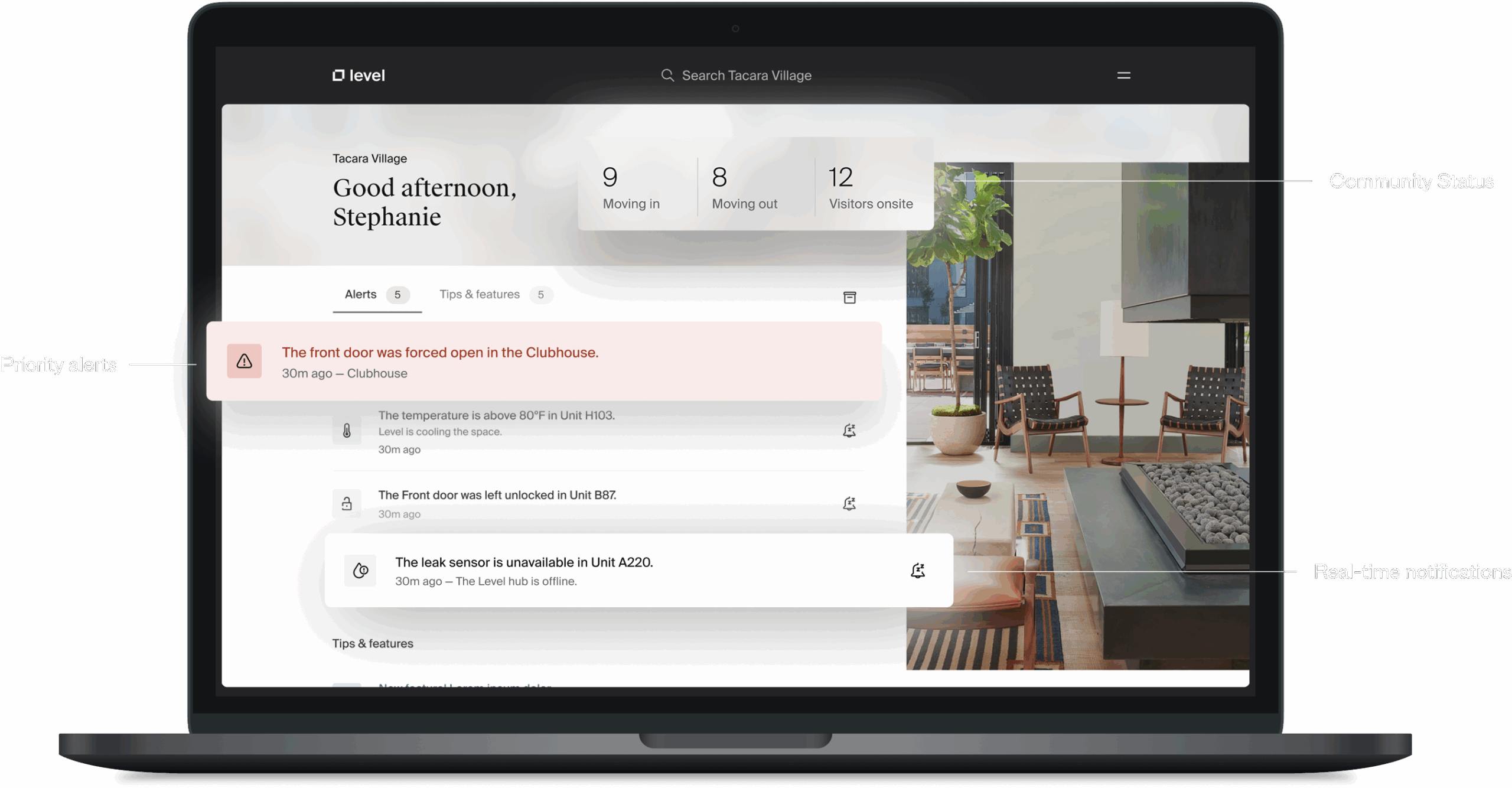
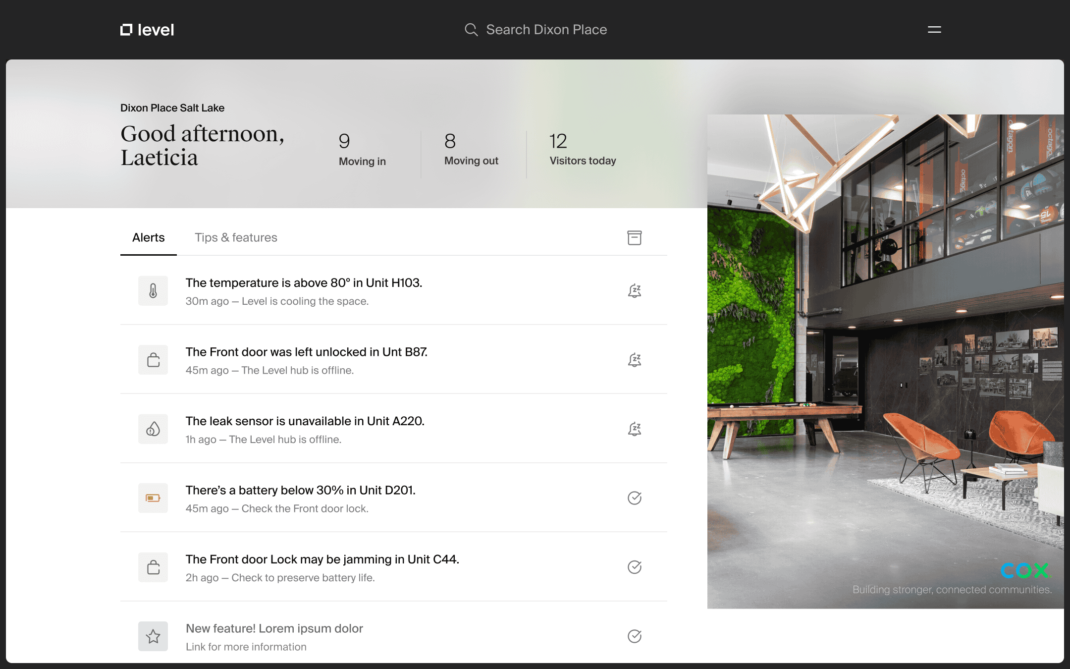
Home Screen Dashboard
Turning scattered updates into a source of alignment and focus
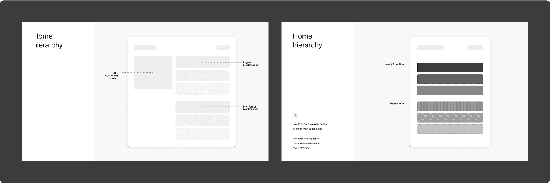
Designing Calm
The initial request was straightforward: create a dashboard to help staff view relevant building information. But in early research and interviews, it became clear that visibility wasn’t the real issue—priority was. Teams were missing urgent updates, relying on fragmented handoffs, and reacting rather than coordinating.
Design Approach
I designed the system with one principle in mind: support awareness without demanding interaction. The dashboard wouldn’t function as a task manager. Instead, it would offer a single, shared view of what needed attention, so teams could communicate and act at their own pace.
Working closely with Level’s Head of Product and internal designers, I defined the logic for what qualifies as “urgent” versus “informational,” and explored how this should appear visually and functionally.
Key design decisions included:
- Creating a tiered notification model with alerts triggered only for high-priority events
- Displaying alerts on the dashboard without requiring dismissal or immediate response
- Using color, grouping, and placement to guide the eye without inducing stress
- Structuring information to align with shift-based team communication patterns
Mapping the Mental Model
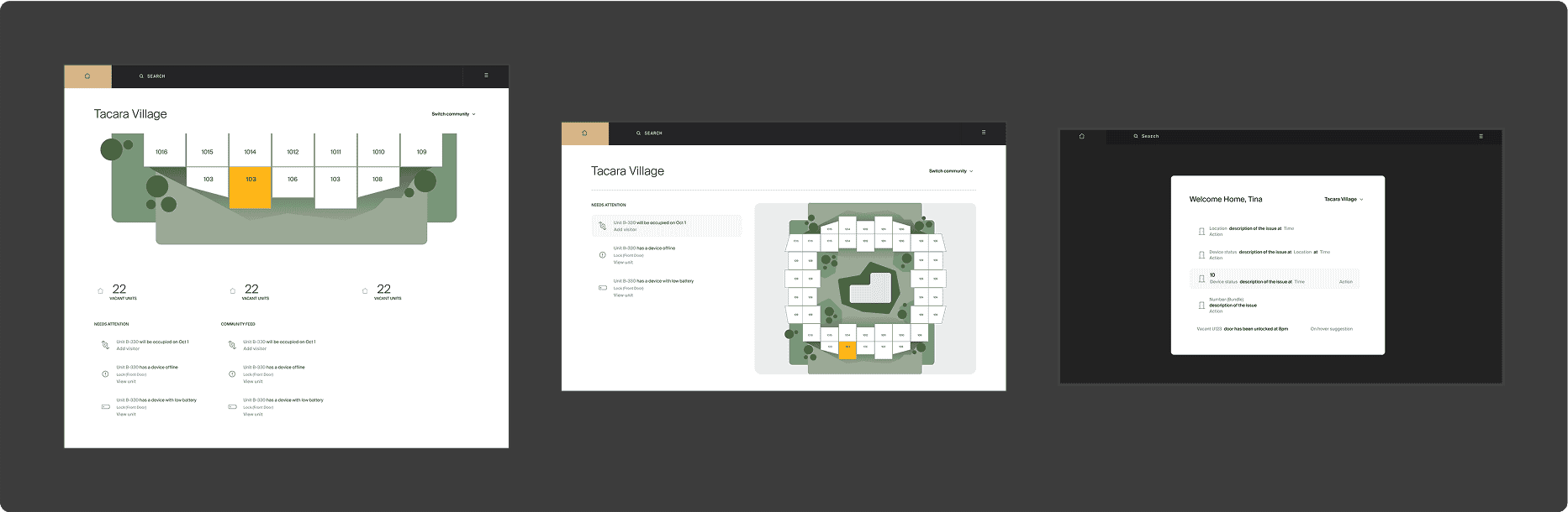
Home Screen Concept Iterations
What We Built
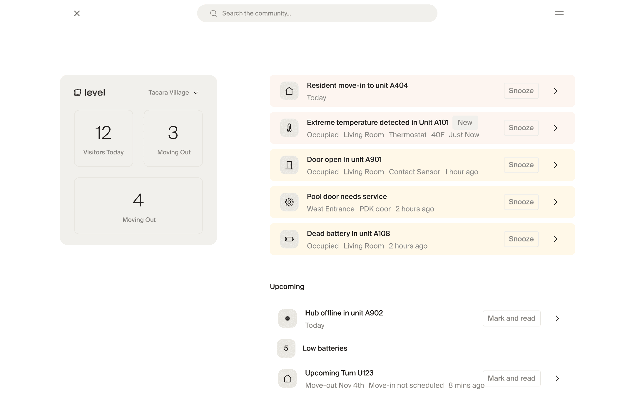
The final dashboard provides a real-time, scannable view of building operations. Staff see urgent issues highlighted visually, while lower-priority tasks remain accessible but non-intrusive. No badge overload. No unnecessary pings.
- Alerts are only triggered when absolutely necessary
- The system promotes shift alignment without interruption
- Staff can quickly understand, coordinate, and act—on their own terms
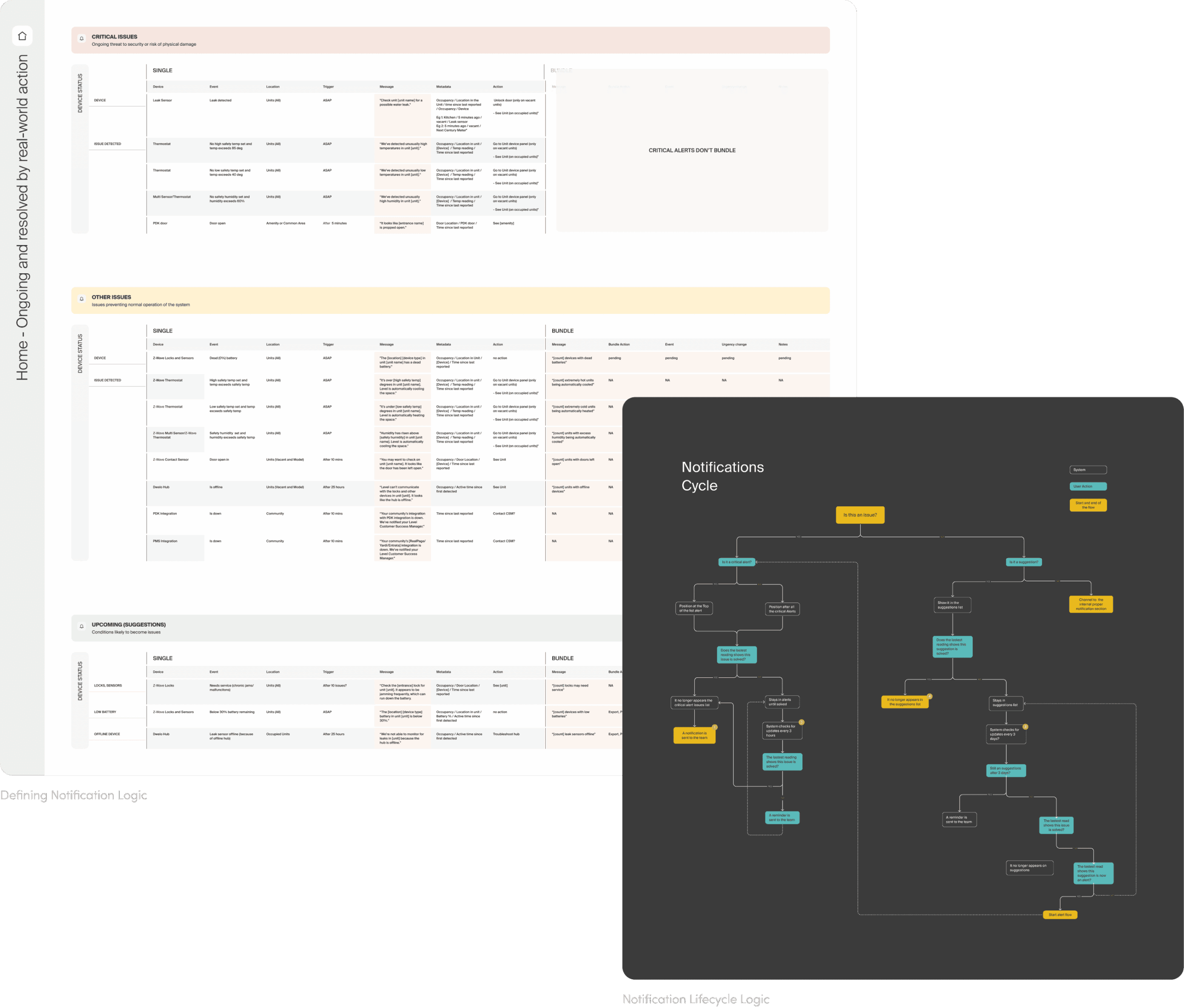
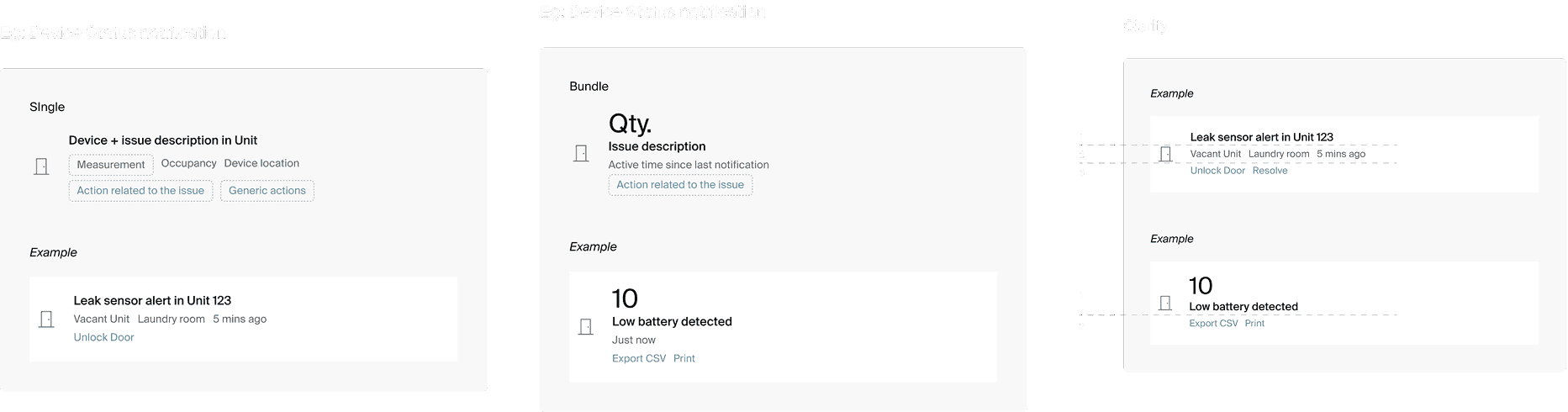
Designing for Clarity at Scale – Single vs. Bundle Notifications
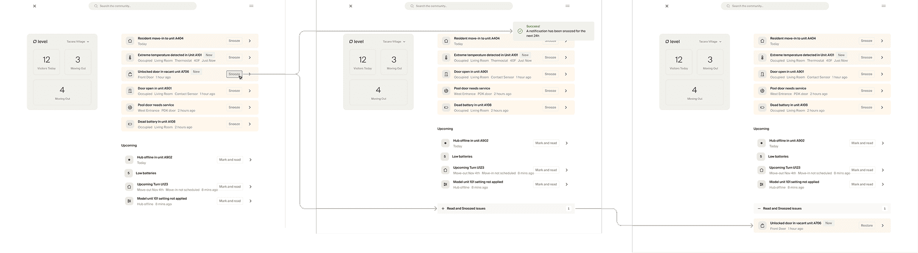
Notification Interaction Flow
Why It Matters
This feature wasn’t part of the original scope—but it became a core differentiator of the platform. Staff now begin shifts with shared awareness, smoother handoffs, and fewer communication breakdowns. Tasks no longer fall through the cracks. And most importantly, the product respects their attention—guiding focus without demanding it.
Within weeks of implementation, the internal team reported clearer shift transitions and fewer missed tasks—without needing more alerts.
Access Permissions
Turning scattered updates into a source of alignment and focus
Designing Confidence
Managing building access is a high-stakes task. But in Level M’s earlier state, it was unintuitive and easy to misuse. Staff weren’t sure who had access to what, and the interface offered little feedback or clarity—leading to permission errors, inconsistencies, and frustration.
The challenge wasn’t just simplifying complexity—it was designing confidence into every interaction. I wanted staff to feel certain about what they were doing and why, without needing extra training or second-guessing the system.
Design Approach
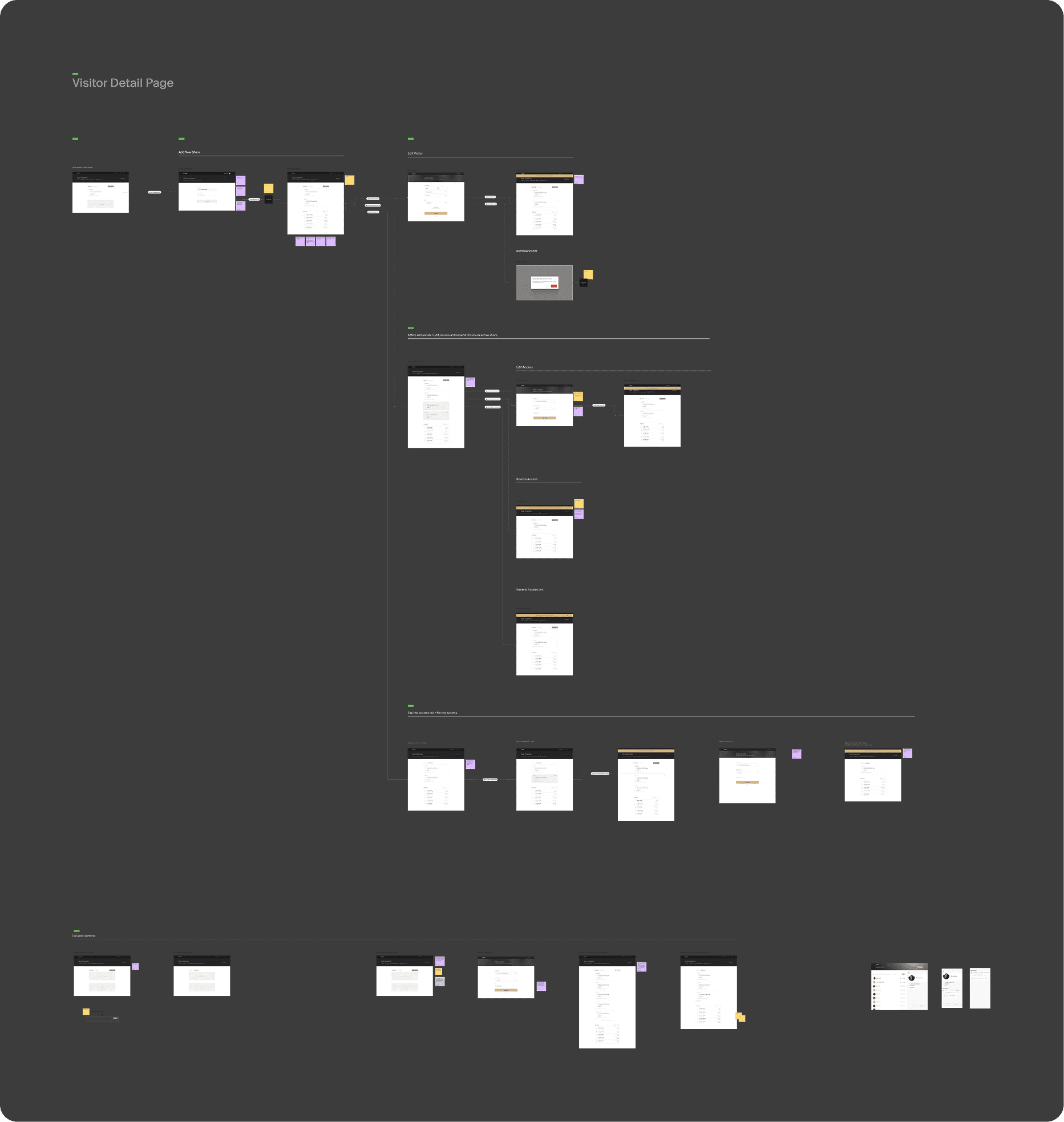
I partnered with Level’s internal product and engineering teams to understand the full access logic: roles, zones, floors, time restrictions, and shared areas. We mapped out key use cases—including scheduled access, vendor overlap, and access revocation—and used these to shape the core flows.
My design process focused on:
- Breaking down the permission logic into clearly labeled, step-based flows
- Reducing options to just what’s relevant for each role and task
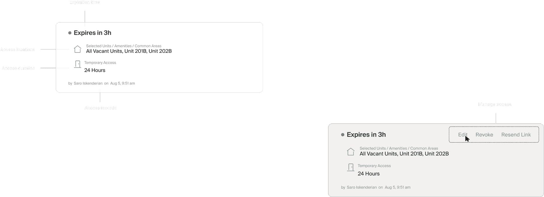
- Making permission states (pending, active, revoked) highly visible
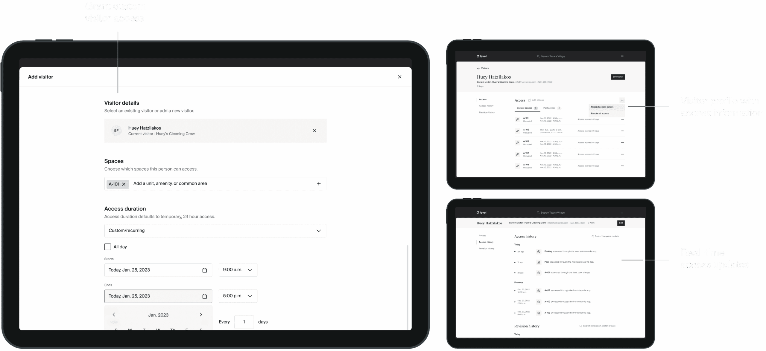
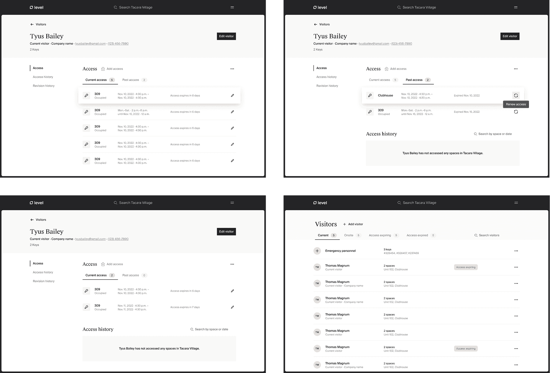
Full user flow exploration for managing visitor access and related unit interactions
Access Management UX Explorations
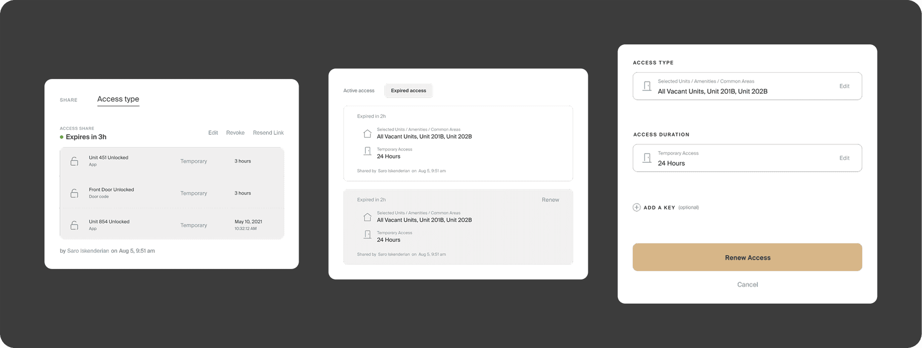
What We Built
The redesigned permissions experience lets staff grant, adjust, or revoke access across property zones in seconds—without needing help or double-checking documentation.
Role-based presets streamline setup
- Feedback appears at every step to prevent errors
- Permissions can be reviewed and adjusted with zero ambiguity
- Designed to work out of the box, with no formal training required
Designing Scalable Access Visibility
Why It Matters
Access control isn’t just a feature—it’s a trust contract. And when the interface makes that task feel risky or unclear, people hesitate, escalate, or make mistakes. This redesign gave staff the confidence to act on their own—faster, safer, and with fewer errors.
After launch, the team noted a drop in access-related support tickets and a higher rate of successful task completion—especially among
new staff.
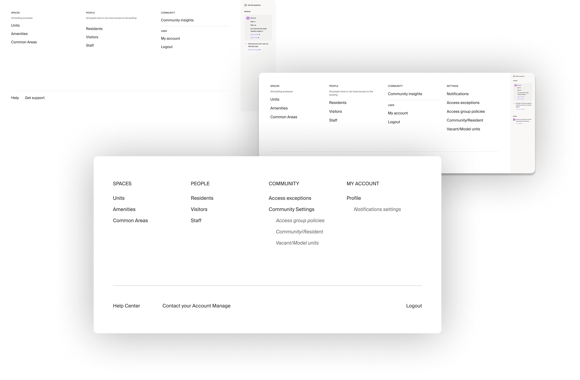
Global Navigation
Reframing navigation around search-first behavior
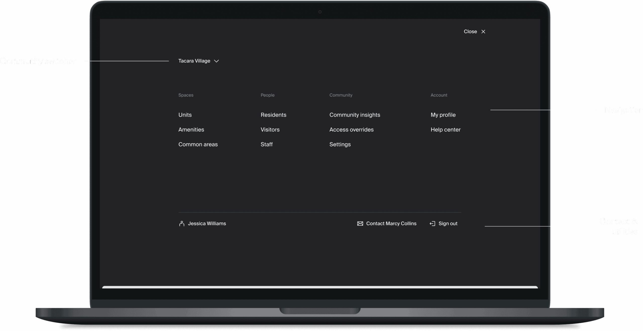
Designing Efficiency
Global navigation was originally scoped as a standard sidebar to help staff access key tools. But once we dug into workflows, it became clear: a traditional nav wouldn’t solve the real issue. Staff didn’t want to browse—they wanted to find.
I advocated for a shift in behavior: treat search as the primary wayfinding method, and position global navigation as a reliable but secondary path.
Design Approach
While I didn’t lead the design of the search feature itself, I played a key role in shaping its role within the navigation model. I worked with the product and design teams to advocate for a search-first structure, provided feedback on how it could better support task intent, and designed the surrounding global nav to support this model.
Key contributions:
- Restructured the nav around high-frequency, task-based groupings
- Positioned search as the primary interaction, with nav as fallback
- Simplified labels using plain language and predictable hierarchy
- Ensured nav items supported both orientation and speed, without clutter
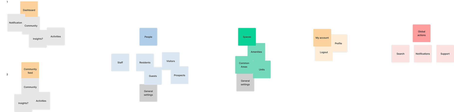
Card Sorting – Navigation Concepts by User POV
Global Navigation Explorations - Structuring Navigation Around Behavior
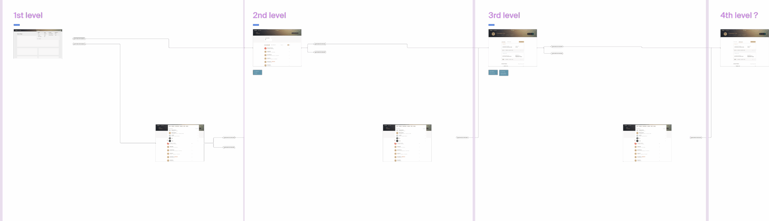
Navigation Hierarchy Mapping
What We Built
- Search occupies the primary position in the global nav, supporting fast wayfinding
- Navigation now functions as a secondary path, not the default
- Menus are organized by task—not team, feature, or department
- Staff no longer rely on memorizing where things live
Structuring at Scale: Global Nav Wireframes
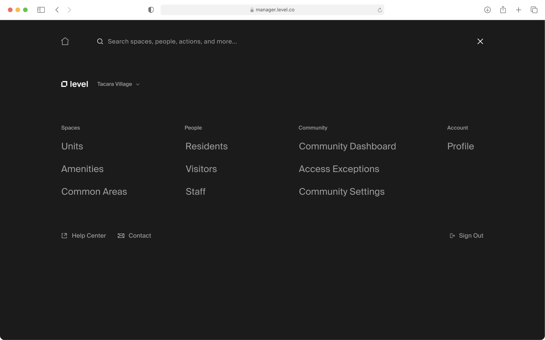
Final Global Navigation Design
Why It Matters
We didn’t just redesign a menu—we redefined the mental model. By helping shift the system toward a search-first model, and aligning the nav structure around behavior, we enabled faster decisions and more confident workflows.
The shift to search as a primary entry point reduced tool discovery time and made orientation easier—even for staff new to the system.
FROM THE CLIENT
“Diana is a pleasure to work with. She is thorough, organized, and always keeps the user at the center of her thinking. I would welcome the opportunity to work with Diana again.”
— SARO ISKENDERIAN
Product @ Ambient (formerly Level)
Final Takeaway
This wasn’t just a set of features—it was a redefinition of how building operations are experienced and executed. By focusing on clarity, calm, and confidence, we designed tools that didn’t just support work—they improved it.
The process of creation should be an act of discovery.
Bret Victor
Contact me at hello@dianapadron.com - Diana Padron. Miami, Florida