Client
MaterialPlus
Team
Lead , Senior and a Product designer
2023
White-label Design Language System
DLS for our product design team
The DLS aims to standardize and optimize our processes. The DLS includes foundational elements like typography, color, and components.
My role was to guide the strategy for the structure of the file, be responsible for most of the production work, and establish the governance structure. I ensured that the file would be useful for our designers as a blueprint for their projects without being prescriptive. The file serves more as a guide than a mandatory document, filled with best practices and guidance to maintain a high-quality standard of work across the digital discipline.
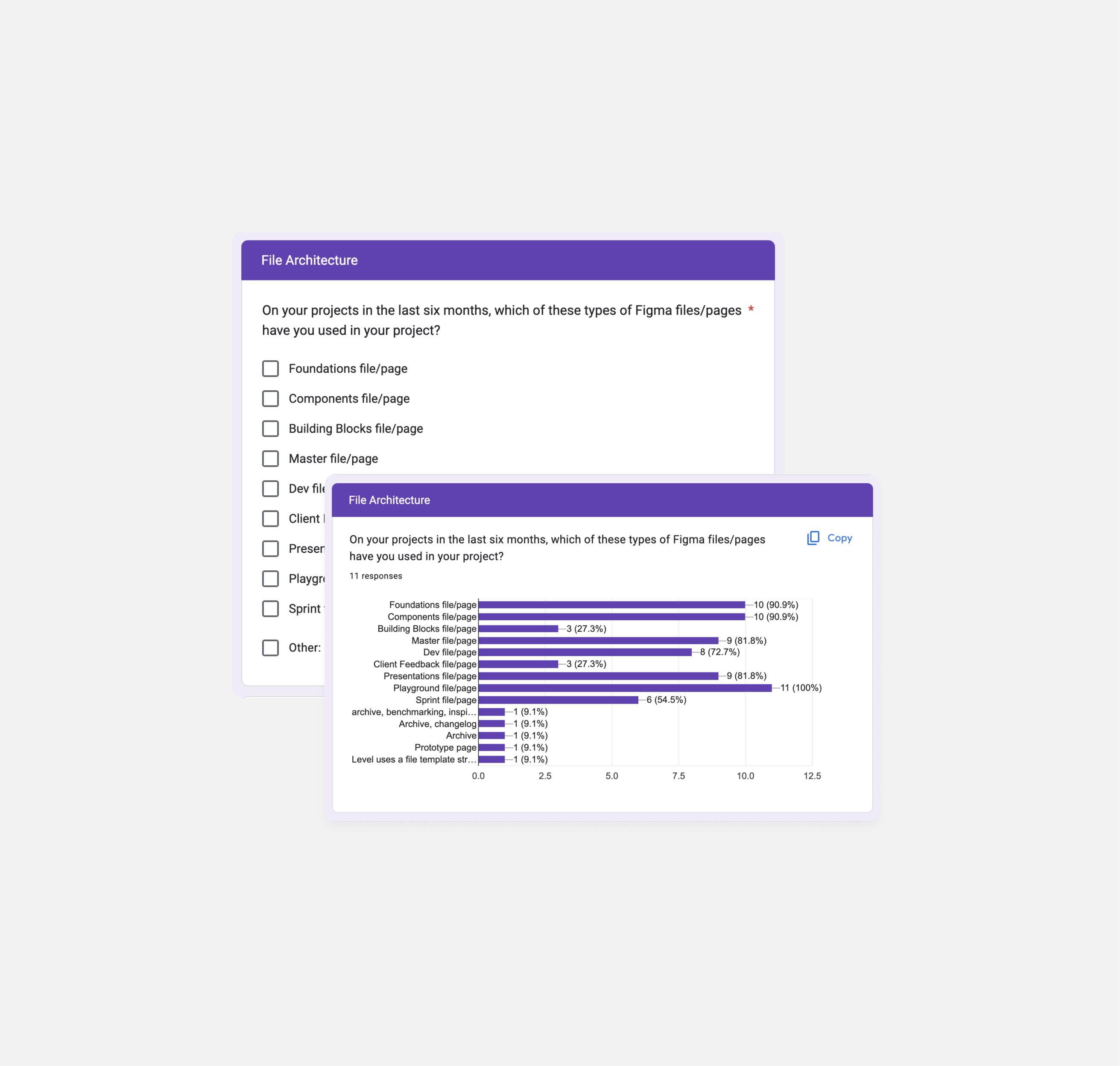
The DLS is structured into two main Figma pages: Foundations and Components. Extensive research and benchmarking informed its development. The system promotes best practices, accessibility, and efficient collaboration.
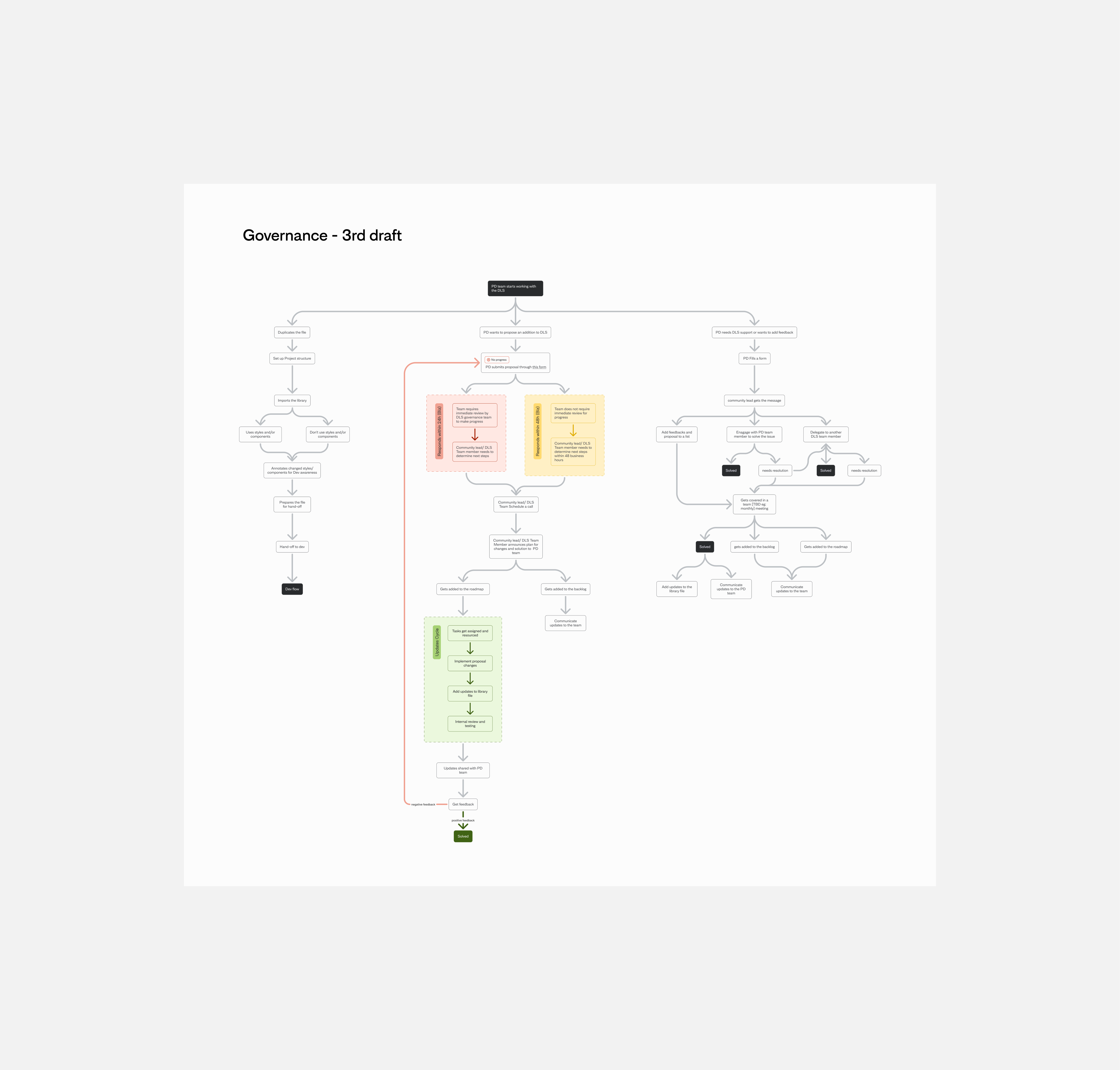
Governance and continuous improvement are emphasized to maintain its relevance and effectiveness. Future phases will focus on onboarding and education.

Impact
Design language systems (DLS) are continuous processes, and that's part of their beauty. A solid foundation is critical to the lifecycle of any product, so it is essential to get it right from the start. We hope this serves our team well and positively impacts many future projects.
The process of creation should be an act of discovery.
Bret Victor
Contact me at hello@dianapadron.com - Diana Padron. Miami, Florida